Engoo
English Tutoring App
Project Overview
Background
Engoo offers private one-on-one English tutoring from tutors all over the world from any device. A great percentage of their students use their mobile device to attend their English lessons. Currently Engoo’s website is predominantly designed desktop first.
Challenge
Engoo has found that students have a difficult time navigating to the level guide and making an accurate identification of their comprehension level prior to starting a lesson. Students only have the level guide to make their informed decision, and commonly takes a few lessons until they have found their right level.
Engoo wants to improve the user flow to make information about the level guide easier to access and comprehensible by the students.
Solution
Re-design the level guide with mobile-first in mind, to improve students experience with learning on their smaller devices.
Design new features that guide students in obtaining the appropriate information for them.
Year: 2021
Tools Used: Miro, Zoom, Figma
Role: Research, UX Designer, UI Designer
Project Type: Self directed - University assignment, feedback from lecturer and peers
Research
Research Goals
Uncover users pain points that would make navigating to the level guide difficult.
Identify opportunities for providing further assistance to the students.
Identify how to refresh and generate consistent UI
Methods
Secondary research
Competition
Primary research
Engoo representative interview
Ideation
Creation
Test and Iterate
User Observation & Interview: Mobile
Participants
Participants interacted with other pages and elements in hopes of navigating to the level guide somehow, as they couldn’t find it from the header navigation bar.
After a while of exploring ways to get to the level guide, users identified that the footer navigation had a link to the level guide.
Users did not identify there was a link at the materials page leading to the level guide
Thought it was indicating a “click here for more information about materials”, so it was overlooked quickly despite it being placed within the Materials page header.
Information about the levels were understandable, but layout was displeasing.
Engoo Representative
Tutors will generally just follow their gut instinct based on all the students they have taught in the past and what level seems appropriate to their students. Basically the level guide is more intended for the student themselves outside of lessons.
Engoo has not conducted user testing for the level guide.
Majority of their students use smaller devices such as their phones or tablets.
UI for the materials & level guide pages are different to the homepage. This is a challenge that cannot be addressed as the higher up’s are set on their vision. Non-Japan markets follow an updated design style-guide, whereas the Japanese market uses the design style seen on the materials page and level guide page.
Wireframes
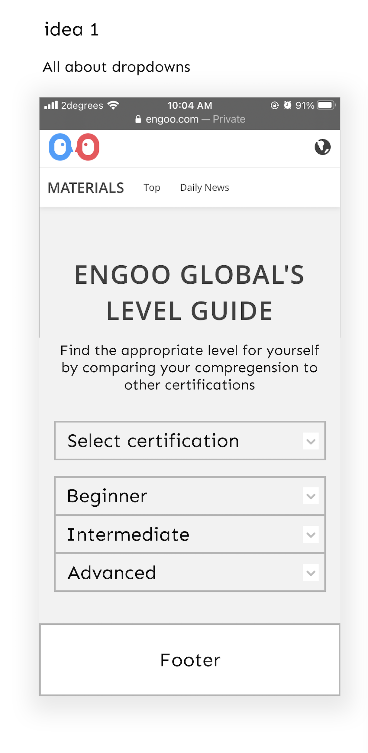
Using a screenshot of current Engoo’s website as a template made it easier to envision how well elements would be placed within the page, as well as the sizes for these elements.


High-Fidelity Prototype
Usability Testing
To evaluate whether the design has addressed the problem regarding the level guide process, I conducted usability tests on three participants.
Testing Insights that Informed Iteration
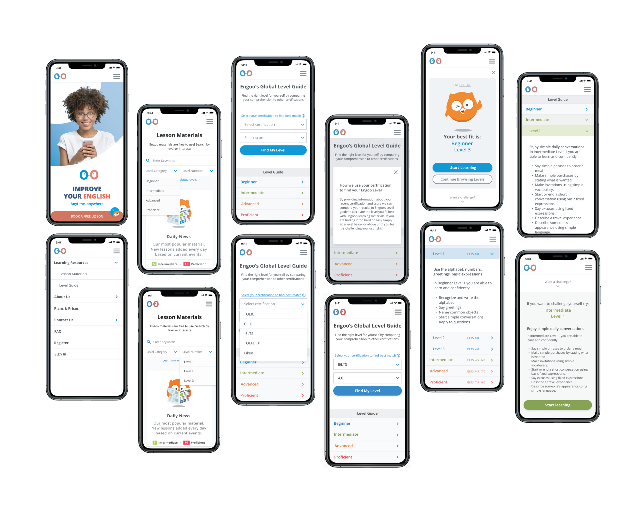
Use of colour specific for each level
This can allow users to identify levels more efficiently based on their colour.
Relation seen between level guide and lesson materials page through the use of the level colours.
More engaging for students while consuming the information given.
Simplified level descriptions
Using bullet points and simplifying some terms as preferred by some of the users during user testing, have made reading the text easier.
Bulleted form allows for quicker scanning for information, which most students may likely do when there is too much text to read.
Layout of dropdown about level
Improved grouping of contents by using containers helped separate what the user should look at first.
Additional indication of the certification information the user has entered. Above the owl icon - this reconfirms to the user what information they have entered to be given the Engoo level recommended.
Final Version

New Updates Promotion Video
Watch this quick video that summarises what I have changed in order to improve the experience of Engoo students learning on their mobile devices.
Reflection
With the final prototype I have created, I believe that I have fulfilled the design challenge of redesigning the level guide page so that information is easier to access and digest. The addition of the level calculator provides assistance for the student so they may find their right level.
If I had more time I would conduct another usability test of this final prototype to validate or challenge my opinion that it satisfies the brief.
Final Thoughts
I enjoyed working on this project, though I felt that I have not tried exploring other UX methods to find further insights. If I had used more UX methods I wonder if my final outcome would be different. It would be interesting to get actual students of Engoo to try this prototype and gain feedback. Feedback from the actual students would allow me to gain a more realistic insight on what works for them.


